Do you want to optimize your WordPress header design? If you are looking for a simple guide, keep reading this article.
Your website’s header is often the first thing visitors notice. It sets the tone for your brand and plays a key role in navigation, user experience, and conversions.
In this article, we’ll walk you through the most common header design mistakes WordPress users make in 2025, so you can avoid them and create a layout that’s clean, functional, and built for results.
Why You Should Spend Time Optimizing the Header Design
Your website header is the first thing visitors see, so it sets the tone for the entire browsing experience. A well-optimized header makes navigation easier, enhances user engagement, and helps users find what they need more quickly.
It also supports your SEO efforts by making important content more accessible to search engines.
A cluttered or confusing header, on the other hand, can lead to high bounce rates and poor conversions. Whether you run a blog, an online store, or a business site, getting your header right is a simple yet powerful way to boost performance and build trust with your audience.
Hence, spend time optimizing the header design.
15 Common WordPress Header Mistakes to Avoid
In a nutshell, the 15 mistakes are:
- Overcrowding the Header
- Ignoring Mobile Responsiveness
- Using Low-Quality Logos
- No Clear Call-to-Action (CTA)
- Poor Navigation Menu Structure
- Inconsistent Header Size
- Overusing Animation or Effects
- Lack of Branding Elements
- Weak Color Contrast
- No Search Functionality
- Ignoring SEO Best Practices
- Outdated Design Aesthetics
- Missing Contact or Login Info
- Using Too Many Fonts
- Not Testing Across Browsers and Devices
Below, we will show you what these mistakes are and why you should fix them.
1. Overcrowding the Header
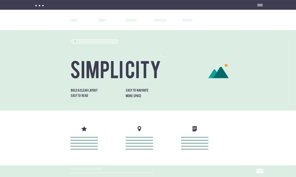
One of the most common mistakes in WordPress header design is overcrowding it with too many elements.
While it may seem tempting to include all your important links, social media icons, and other components in the header, cramming them in can make it look cluttered and overwhelming. This not only impacts the aesthetics but also hinders usability.
A clean and minimalist header allows users to focus on the most essential parts of your website, which improves their overall navigation experience. By keeping only the most necessary elements in the header, you can ensure that visitors are not distracted or confused when interacting with your site.
2. Ignoring Mobile Responsiveness
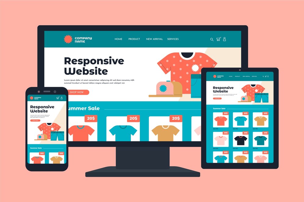
Ignoring mobile responsiveness in your WordPress header design is a critical mistake. With a large portion of web traffic coming from smartphones and tablets, your header must look and function well on all screen sizes.
If your header is not optimized for mobile, elements may appear misaligned, navigation could become difficult, and users might abandon your site out of frustration. Ensuring that your header design adapts seamlessly to different devices improves the user experience and encourages visitors to stay on your site longer.
Testing your header design across multiple devices is a simple but effective way to avoid this mistake.
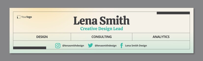
3. Using Low-Quality Logos
Using low-quality logos in your WordPress header can significantly harm your site’s credibility and professional appearance.
A blurry or pixelated logo can make your website look unpolished and less trustworthy, potentially turning visitors away. It’s essential to use high-resolution logos that retain their clarity across various screen sizes.
A well-designed, sharp logo not only reinforces your brand identity but also enhances the overall design of your header, contributing to a positive first impression. Always opt for vector files like SVGs, which scale without losing quality, ensuring your logo looks crisp and professional on all devices.
4. No Clear Call-to-Action (CTA)

A header without a clear call-to-action (CTA) can miss an opportunity to guide users toward essential actions on your site. Whether you want users to make a purchase, sign up for a newsletter, or contact you, a CTA in the header makes these options immediately visible and accessible.
Without a prominent and well-worded CTA, visitors may not know what action to take next, leading to a missed opportunity for conversion. Ensure your CTA stands out with a clear, concise message and a contrasting design, so users know exactly what to do when they land on your site. A strong CTA helps to drive user engagement and is essential for any website looking to achieve its goals.
5. Poor Navigation Menu Structure
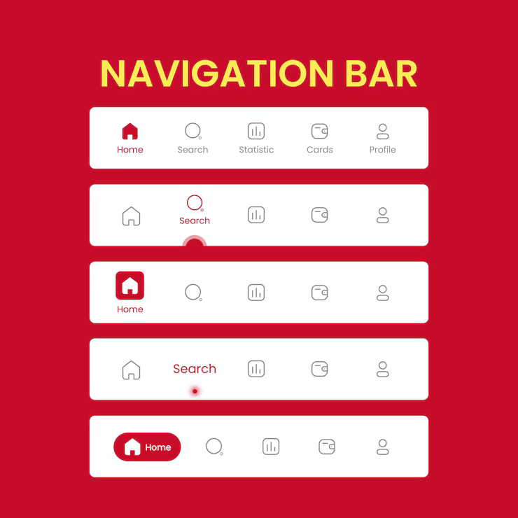
A poorly organized navigation menu in your header can confuse visitors and make it difficult for them to find key pages on your site.
An overly complicated or cluttered menu increases the chances of users leaving because it makes it difficult for them to locate the information they need easily. To avoid this, keep your navigation simple, intuitive, and organized by grouping similar pages.
Use clear labels for each menu item and limit the number of options to avoid overwhelming users. A well-structured menu not only improves the user experience but also helps search engines understand your site’s content hierarchy, which in turn improves your site’s overall SEO performance.
6. Inconsistent Header Size
Inconsistent header sizes across different pages can create a disjointed and unprofessional look. A header that changes size as users navigate your website can confuse and make it harder to establish a cohesive brand identity.
It’s essential to maintain a uniform header size throughout your site to create a consistent and polished design.
The header should adapt to mobile responsiveness while remaining consistent in its overall proportions across different screen sizes, ensuring a smooth and cohesive user experience. Consistency in header design helps build trust with your audience and improves site usability.
7. Overusing Animation or Effects

While animations and effects can enhance a website’s visual appeal, overusing them in the header can distract users and negatively impact performance.
Excessive movement or flashy transitions can make the site feel cluttered and reduce the overall user experience. Additionally, too many animations can slow down load times, which might lead to higher bounce rates.
It’s essential to use animations sparingly and only when they serve a functional purpose, such as drawing attention to a call-to-action or providing visual feedback. Simple, subtle animations are often more effective in keeping your website clean and user-friendly.
8. Lack of Branding Elements

Failing to incorporate branding elements into your header can lead to a lack of recognition and trust with your audience.
Your header is one of the first things visitors see, and it should reflect your brand’s identity through elements like your logo, color scheme, and typography. Without these consistent visual cues, users may struggle to connect your website with your business.
Effective branding in the header helps visitors immediately understand who you are, enhances brand recall, and establishes trust, ultimately improving your website’s professionalism and user experience.
9. Weak Color Contrast

Using weak color contrast in your header can make your website difficult to navigate and reduce its accessibility. Text that blends into the background due to poor contrast can strain users’ eyes and reduce readability, especially for those with visual impairments.
To ensure a user-friendly experience, choose colors that contrast nicely with the background, making the text stand out clearly. A strong color contrast not only improves accessibility but also enhances your site’s aesthetic appeal, making it easier for users to engage with the content.
10. No Search Functionality
Failing to include a search bar in your website’s header can frustrate users and make it harder for them to find what they’re looking for.
A search function allows visitors to access content or products, improving their overall experience quickly. Without it, users may leave your site, increasing your bounce rate and reducing engagement.
Ensure your header includes a visible and easy-to-use search option to enhance user satisfaction and keep visitors on your site for longer.
11. Ignoring SEO Best Practices

Neglecting SEO best practices when designing your header can seriously impact your website’s search engine rankings.
Your header is one of the first places search engines look for important information, like keywords and structured data. Ignoring aspects like including alt text for images, using relevant header tags, and optimizing the meta description of the header can prevent your site from reaching its full search potential.
Always ensure that your header is optimized with SEO in mind, helping both users and search engines navigate your site more effectively.
12. Outdated Design Aesthetics

An outdated design aesthetic in your header can give users the impression that your website is not maintained or trustworthy.
As web design trends evolve, it’s essential to update your header design to keep it modern and aligned with current trends. Using an old-fashioned design, such as heavy gradients or excessive textures, can make your site feel clunky and unprofessional, discouraging potential customers.
Regularly updating your header design ensures your website stays fresh, relevant, and visually appealing to users.
13. Missing Contact or Login Info
Failing to include contact information or login links in your header can significantly hinder your site’s usability. Visitors often expect to find these key details right at the top of your website for easy access.
By omitting this essential information, you risk frustrating users and losing potential conversions. Always ensure that your header features clear links to contact forms or login areas, especially for eCommerce and membership sites.
This simple addition can enhance user experience and build trust with your audience.
14. Using Too Many Fonts

Using an excessive number of fonts in your header can create visual clutter and harm your website’s overall aesthetic.
Consistency in typography is crucial for achieving a clean, professional look that aligns with your brand identity. Overloading your header with different font styles can distract users and make it harder for them to navigate.
Stick to two or three font styles at most, and make sure they complement each other to maintain a visually appealing and cohesive design. This approach will improve readability and enhance the user experience across your site.
15. Not Testing Across Browsers and Devices

Neglecting to test your header design across various browsers and devices can lead to significant usability issues.
A header that looks great on one browser may not appear as intended on another, or it may break entirely on different devices.
It’s crucial to check how your header functions on popular browsers, such as Chrome, Firefox, Safari, and Edge, as well as on mobile devices with various screen sizes. Regular testing ensures that your header remains functional and visually appealing for all users, regardless of the device or browser they use.
Without this step, you risk frustrating visitors and potentially losing traffic.
Frequently Asked Questions
Now, let’s check the popular frequently asked questions regarding this topic.
Why is the header design so crucial for my WordPress site?
The header is the first thing visitors interact with, and it sets the tone for their entire experience. A well-designed header ensures that users can easily navigate your site, find essential content, and engage with your brand. It’s crucial for both user experience and SEO performance.
How can a poorly designed header affect my website’s performance?
A confusing or cluttered header can overwhelm visitors, leading to high bounce rates and poor conversions. If your header doesn’t align with user expectations or is hard to navigate, it can negatively impact your site’s usability and SEO rankings.
What are the common mistakes to avoid when designing a WordPress header?
Some of the most common mistakes include overcrowding the header with too many elements, neglecting mobile responsiveness, and using fonts that are unclear or difficult to read. These mistakes can hinder user experience and impact your website’s performance.
How can I make my WordPress header mobile-friendly?
To make your header mobile-friendly, ensure it’s responsive and that all elements resize appropriately on smaller screens. Avoid overcrowding the header with too many elements, and consider a simple, minimalist design for easier navigation on mobile devices.
Should I include a call-to-action (CTA) in my header?
Yes, including a clear and concise CTA in your header is a great way to guide visitors toward key actions, like making a purchase, signing up for a newsletter, or browsing specific content. A CTA in the header can improve conversions and user engagement.
Conclusion
Optimizing your WordPress header design is crucial for both user experience and your site’s overall performance.
Avoiding common mistakes, such as cluttered layouts, poor mobile responsiveness, and unclear branding, can significantly improve visitors’ perceptions and interactions with your website.
By focusing on simplicity, clarity, and functionality, you can ensure that your header is visually appealing and efficient in guiding users to your content. Remember, a well-designed header is the gateway to a positive user experience, which can lead to higher engagement and improved site performance.
Do you know any other mistakes most people make?
Let us know in the comments.
Leave a Reply